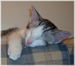
I have been a busy little bee (read: snowed under!) in my craft room making masculine birthday cards as well as sewing a cat costume for my daughter to wear to school at an event they were holding the other day. Most of the men in my immediate and extended family have birthdays in August. Throw in a few girlfriend's birthdays in August as well and boy, that sure fills up the month; not to mention Father's Day here in Australia yesterday (Sunday 2nd September). Phew: that's a lot of cards!!
Sometimes people ask me about making masculine birthday cards and how to approach the task - and I think alot of the time, it is just far easier to keep it simple and not overthink it. After spending a few years approaching masculine cards with the viewpoint of "they are so hard" which meant I felt like I was defeated before I had even started, I took a step back this year and decided to have a really good look at what was actually hard about them.
So how do I approach my masculine cards with a view to not making the process difficult?
I really just use simple layouts that I know work and try to pick an image that isn't too detailed to colour or use a pre-coloured topper/paper tole/decoupage image. I think that pre-coloured toppers or decoupage/paper tole images are just fantastic and make the process easier. There are so many toppers etc. available now that are just perfect for masculine cards whether they are a sport-loving man, a dog lover or a man who likes to read books. Even just having a fairly large sentiment as the focal point can be enough - see THIS card that I made for our cousin's 90th birthday. If you don't have a sentiment shaped like the one that I used, have a play on your computer eg: Microsoft Word, and print one on cardstock instead.
And I love to use kraft cardstock - it seems to shout MASCULINE to me - and you can brighten up the card with a small amount of a brighter colour so your card isn't too dull.
The two cards I am sharing today were for my husband's birthday and my brother-in-law's birthday - and use the Docrafts Wellington Bear images which I love so much. This first card was for my husband:
As you can see, it is a very simple layout - one of my "go-to layouts". The image is diecut decoupage (paper tole) so all I had to do was pop out the pieces and put them together with dimensionals. The sentiment is from the same pack and this is popped up on dimensionals.
I added a blue heart button to balance the sentiment and ribbon. I sewed some blue sewing thread through the button as I don't like naked buttons on my cards then glued the button on using Crafter's Pick Incredibly tacky glue (LOVE this glue!).
I used my Perfect Layers Tools to trim the blue cardstock layers to 1/16" and the kraft cardstock layers to 1/8". The ribbon has had Fray Stop added to the cut ends to stop them from fraying.
The dotted designer paper is from the LOTV Country Gent pad and the striped paper is from the Wellington Bear pad. As you can see, I added a layer of blue cardstock to brighten up the kraft cardstock a little.
Now, here is my 2nd card which I made for my brother-in-law:
As you can see, it is another very simple layout - one that I use alot and is another of my "go-to layouts". I was actually putting the finishing touches to this card as my brother-in-law was chatting to my husband in the kitchen - talk about last minute!
The main image is a topper so no layering on this one. I popped the sentiment up on dimensionals just to add a bit of interest. The side border was punched with my old favourite: Fiskars Threading Water. The 3 copper brads are by PrintBlocks. As per the first card, I added Fray Stop to the cut ends of the ribbon.
The plaid designer paper is from the LOTV Country Gent pad and the striped paper from the Wellington Bear pad. The layers are trimmed to 1/8" using my Perfect Layers Tools.
I hope my cards inspire you a little in your masculine card making. You can check out my other Masculine cards HERE. I have a couple of other masculine cards to share over the next few weeks: watch this space!
Thanks for stopping by! Have a great week!
Jocelyn
Card Recipes:
Card #1 -
Stamps and Ink: None
Designer paper: Lili of the Valley Crab Apple Lane 'Country Gent' 8" x 8" pad, Docrafts Wellington Bear 6" x 6" pad
Accessories: Docrafts Wellington Bear decoupage (paper tole) pack (incl. sentiment), dimensionals, blue heart button - Dress It Up Icecream Soda #2779, blue sewing thread, Crafter's Pick Incredibly tacky glue, brown stitched grosgrain ribbon, Fray Stop, Perfect Layers Tools, cardstock - kraft, blue
Card #2 -
Stamps and Ink: None
Designer paper: Lili of the Valley Crab Apple Lane 'Country Gent' 8" x 8" pad, Docrafts Wellington Bear 6" x 6" pad
Accessories: Docrafts Wellington Bear topper and sentiment, dimensionals, Print Blocks copper brads, Perfect Layers Tools, brown stitched grosgrain ribbon, Fray Stop, cardstock - kraft
Punches: Stampin' Up corner punch, Fiskars Threading Water border


.jpg)


1 comment:
Wonderful cards both of them Jobear and so agree cant beat CAS love them, and yes cut mine finishes pretty fine too :D Shaz in oz.x
Post a Comment